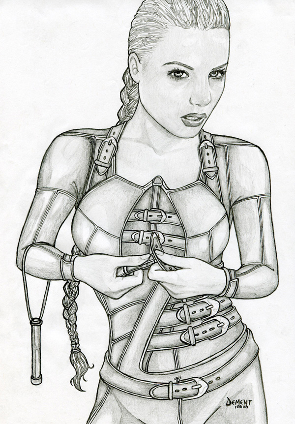
I was inspired to draw this picture after reading "Chainfire" of "The Sword of Truth" novels. "Chainfire" really touched my heart and gave me the feeling that I know Cara. Terry Goodkind is extremely talented and his characters are very alive in every book he's written so far but with Cara in "Chainfire", he's really outdone himself.
In my years of drawing, I've never been inspired to do fan art. I always do my own characters but Terry has opened doors in my artwork.
Critisism:
Here's the one thing I've noticed wrong with the picture. The proportions are exact and on the money with the model that I used ut on her right arm, I botched the shading a bit and it seems to make her arm a bit too small. Mistake noted.
Thanks for the comment anaesthetic I think the only reason I went with a shorter agiel is that after reading about
what Denna did to Richard, it eases the mind abit to imagine it a little smaller
And as for the sun/moon logo, when I drew this I was sure about the whole copyright thing and if it would be ok to
make it so obvious this was Cara. After all, Anne McCaffrey persecutes those who draw her stuff. Maybe I'll add
the logo in now that I've learned Terry supports fan art.
--
Dawn of a New Era: [link] wicked Hatchet/Girl-Who-Owned-A-City/Lord-of-the-Flies/ style story... come read. and also come and check out my prints. help feed a hungry artist
I think the head is much too big. At first it seems to me as if the head doesn’t fit to the rest of the body. The expression of the face is nice.
For me the body properties could be much better. For example: The arms and the hands don’t really fit together, because the arms look to short in front of the arms.
Thanks for the the comment Adlerlrene. Now that it's been quiet awhile since drawing the picture, I find it easier to see what other people do about misproportion on this one. It is definately though, a matter of shading. The drawing had a real life photo model and as for the overall shape, size, and proportions... I'm right on the mark. The problem is that the photo was from slightly above perhaps which adds to the larger head people are getting at. The rest is totally a matter of not enough shadow. Had I done it properly, it would make it easier to see that the head is closer to the camera and the feet farther away. I mentioned something about this in the description I believe. Thanks for taking the time to point things out... best wishes
DeviantART and the martial arts action film, Ninja Assassin, have teamed up to allow ALL deviants the ability to install Journal Skins! Select an awesome Ninja Assassin skin or choose the skin of your choice.
Daily Literature Deviations is a group that is dedicated to bringing literature to the forefront of the deviantArt community. We attempt to accomplish this by daily featuring Literature artists from around the community that deserve the recognition, but are not getting it.
Each day we will feature 5 deviations from the Literature categories in a News Article. In order to support the artists that we feature, we ask that you the news article as well as check out the individual pieces. We understand that each day you may not be able to check out each and every one of the pieces, everyone has their own things going on. We just ask that you make an attempt to help support the growing Literature community.
The Deviousness Award is an accolade which is traditionally handed out on the 1st of every month to one trully outstanding deviant. `Cyantre is one of the most helpful deviants within our community. With a positive attitude and a resourceful mind, you can always find him providing support and encouragement to those in need. Always looking for ways in which he can get more involved in our community, John's positive presence is to be aspired to. A well respected poet, John is a must-have on your deviantWATCH to make sure that you don't miss out on your dose of community inspiration. It's with great pleasure that the Deviousness Award for November 2009 goes to... Read More
Comments
Should there not also be the sun/moon logo?
what Denna did to Richard, it eases the mind abit to imagine it a little smaller
And as for the sun/moon logo, when I drew this I was sure about the whole copyright thing and if it would be ok to
make it so obvious this was Cara. After all, Anne McCaffrey persecutes those who draw her stuff. Maybe I'll add
the logo in now that I've learned Terry supports fan art.
--
I'm a scout for... DrawFantasy.com
[link]
--
Dawn of a New Era: [link] wicked Hatchet/Girl-Who-Owned-A-City/Lord-of-the-Flies/ style story... come read. and also come and check out my prints. help feed a hungry artist
--
I'm a scout for... DrawFantasy.com
[link]
Her arms seem too short though.
I'm working on one of Berdine and Raina again, you should check it out in my scraps.
--
Just so we both understand eachother: I don't clip my fingernails so this is really, really gonna hurt...
-Jerk City [link]
~AdamZivojnovich is a pretty pretty princess.
~RE4Club
For me the body properties could be much better. For example: The arms and the hands don’t really fit together, because the arms look to short in front of the arms.
--
"May your lead never dull"
--
"May your lead never dull"
Previous Page12Next Page